Amazon Appstore on Kindle Tablet
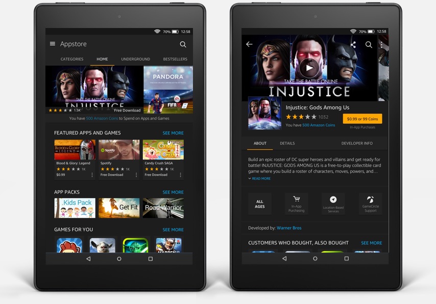
Overview The Amazon Appstore FOS5 redesign was an enormous undertaking. I was responsible for discovering and identifying user pain points and friction throughout the Appstore experience and then working closely with the Product Manager to design and deliver new features to assist customers with searching, browsing, discovering, purchasing, downloading, and consuming an app. Although I leveraged the existing FireOS pattern library and style guide, the more technical feature implementations where custom designed for our Appstore experience.
CompanyAmazon RolesLead UX Designer, VXD, IXD, IA, User Researcher Year 2014 - 2016
Research and Competitive Analysis
Prior to the design of FireOS5, I had owned the design for the previous 2 generations of Appstore on the Fire Tablet. After completeting FireOS4, I ran a formal usability study to gather feedback from our customers based on the existing experience to help us identify pain points and validate assumptions that we had made as a team.
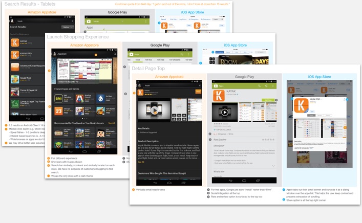
This was followed by a competitve analysis that I ran - comparing several core scenarios using Amazon Appstore, the Google Play Store, and Apple's Appstore. In my findings I created a deck that ran through these core user scenarios and included side by side comparisons. For each screen, I identified the major deltas and included relavant user feedback and usage metrics that we had gathered, thus giving additional context and understanding to each scenario.
Both of these research methods resulted in a list of gaps and customer issues that needed to be solved. I created user stories for these issues and features and entered them into the backlog. From there, I worked with the Product Manager on triaging and priortizing user stories based upon customer and business impact, competing feature requests, and scope of development work.
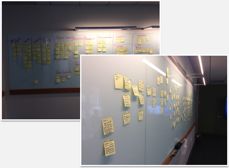
Brainstorm To help generate more ideas in an effort to provide innovative features, I facilitatied a "Think Big" brainstorm with a room full of designers, developers, managers and our director. From the session we generated over 100 unique ideas. Over the next week, the project manager and I painstakingly prioritized these ideas and were able to narrow down the list to the top 25 ideas we felt would have the most customer and business impact. These features were reviewed and approved through leadership, and this helped us suppliment our product roadmap for the year.
Gateway Carousel
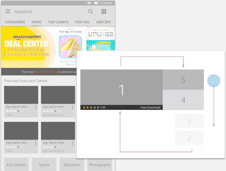
I dove first into white-boarding exercises and wireframes for the "gateway" or home page of the Appstore buy experience. The core top navigational component across all the Stores (Apps, Music, Books, Video, etc) was being modified to align with Androids swipe navigation model. This was an abrupt change to our current model where a user could swipe individual rows of apps to expose more apps. Now a swipe would navigate a user to an adjacent page. For this reason we had to increase the relevancy of the content we were showing and find ways of showing more content when first arriving at the gateway.
To help solve this problem I decided to first target the more core elements of the gateway such as the billboard carousel at the top of the screen (as seen above). My goal here was to expose more apps at a glance, where prior to this only one app was seen at a time in the billboard carousel. My new design allowed for up to 4 billboards to be seen simultaneously. This new carousel method was ultimately adopted as the official component for the billboard carousel and was adopted by both the Games and Music stores.
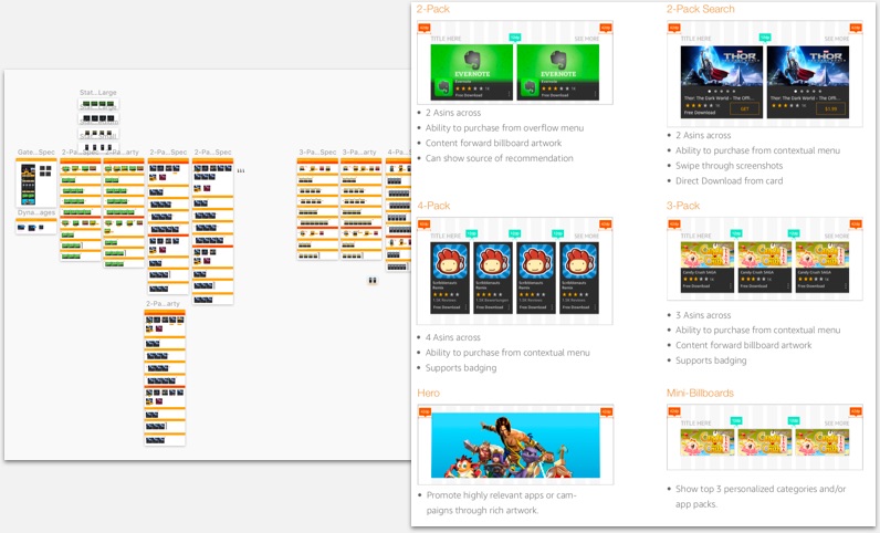
Gateway App Layout In my effort to increase the effectiveness of the content we were showing on the gateway, I felt that Appstore could improve upon the Kindle Platform's suggested layout schema, by adding a tile set that allowed for 4 apps to be displayed, instead of just 3. Additionally I proposed a more "content forward" approach, bringing rich app artwork forward in the browse experience. This required a larger visual footprint, but was utilized for top performing apps and helped generate more click-throughs. See above for an overview of the variations that I designed for the different tile layouts across over 9 separate tablet devices with varying sizes and pixel densities.
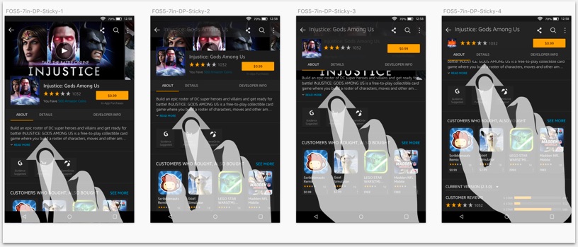
Detail Page Sticky Header I proposed many new design elements for the App detail page, however one of the most significant was the collapsing header or the “sticky header”. Prior to this, when scrolling the page, the ability to purchase or download the app was lost. Working with my prototyping team, we created a proof of concept for scrolling the screen and having the header collapse and stick to the top of the screen, thus helping the user maintain key information on the screen at all times and allowing the user to purchase without having to scroll back to the top of the page. Up to this point the detail page had always maintained a very "static" feel. This was the first time Appstore had introduced a truly fluid transitional design interaction.
Apps Library Revamp
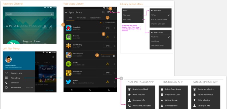
Previous to the redesign, Apps were launched from the Apps Library since there was not yet a concept of an Apps grid on Kindle on the device home screen (believe it or not). Apps were launched from a singular carousel that was sorted based on recency. If a user wanted to see a list of their apps, they had to navigate to a separate Apps Library. Since the updated devices were finally getting an Apps grid with FOS5, a dedicated Apps Library was no longer needed to launch apps, so I proposed that we modify the purpose of the Apps Library and instead make it an app management area, where apps could still be launched, but the focus would be on the ability to uninstall apps, update apps, manage subscriptions, and sort or filter apps that you own.
There was a lot of pushback on this approach due to the fear that customers would still want the Library to be a launcher since that is what they were familiar with, it still was a Library after-all. Ultimately I was able to convince leadership that we would be wasting an opportunity to provide a much more robust management mechanism to our customers, and that our customers would be using the Home screen Apps grid to launch apps once the change was in place. This assumption was also validated through user testing. All users in the test launched their apps through the apps grid on the home screen. Needless to say, the change was agreed upon and implemented.
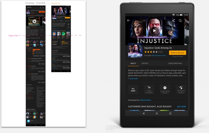
Detail Page Optimization The previous detail page had a glaring problem - IT WAS TOO LONG! Customer abandonment was significant the further a user scrolled down the page. So I proposed a design that would decrease the length of the page by 50%, and give the ability to access less relevant information through tabs that appeared above the fold. I wont lie it was a hard sell to the platform team since this wasn’t aligned with the patterns they had set forth and there was a rumor that Jeff B didn't like tabs :-) Also, the platform design philosophy at the time was that we show EVERYTHING on the page and let the user scroll. Ultimately, the decision had to be escalated, but through A/B testing, we found that customers where happier with the shorter page, and didn't have any issue with finding the tabbed information. I was given VP approval to move forward with the design choice even though at the time it was considered an anti-pattern.
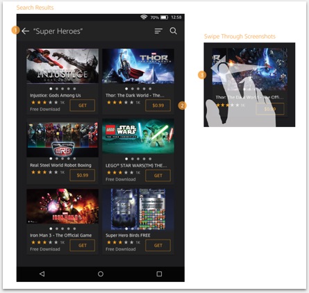
"Content Forward" Search Results Appstore’s previous search was a very underwhelming experience. When someone would search, the results were just a big list of Apps. I knew that we could do much better. Apps had so much rich content and many times you would have customers “pogo sticking” back and forth between search results and the detail page just to see the screenshots, or check the star rating. The majority of Customer drop-offs occurred after the 6th search result. I realized that if we could bring that information forward in the discovery funnel, we could help eliminate the pogo-sticking, keep users more engaged, and allow them to make a much quicker purchase decision based on key information they cared about (Price, Screenshots, and Star Rating). After designing the layout and interaction we prototyped the idea and got it in front of users. It was an instant hit and we released it that same year! This was by far one of my favorite features to design for FireOS5.
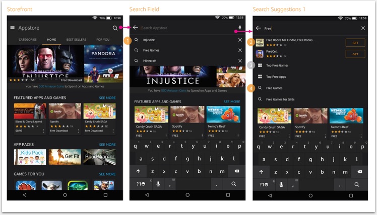
Enhanced Search Suggestions For those customers who know what they want, we were still forcing them to navigate to the detail page to make there purchase. So, rather than add that friction to the search process, I designed a more detailed search suggestion list that included the ability to download the app right within the suggestion area. Additionally we would expose direct links to categories that matched the search query.
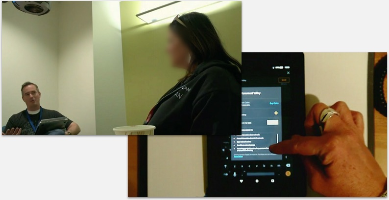
User Research Of course, a fair amount of research went into validating these designs. I was responsible for contracting a research partner to help us since we didn't have a dedicated research team. Once that was in place, we had a the agency recruit our participants, while I wrote the screener, the usability test, I prepped the prototypes, recruited observers, moderated, and made sure there were snacks at the table :-) Afterward, I gathered and analyzed the data, and published the results to the team and leadership. My testing method of choice is the R.I.T.E Method (Rapid Iteration, testing, and evaluation).
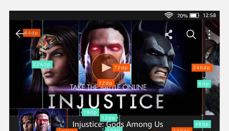
Redlines I owned generating all redlines and asset creation which accounted for over 7 different devices of varying sizes and pixel densities. Tools such as “Sketch Measure” made this much easier, but still, it was a very time consuming task. However, it pays off big time when developers have all they need to knock out a feature design without an exorbitant amount oversight from UX.